Skills utilized
JavaScript, HTML, CSS
PHP
prototype creation
participatory design
task analysis
expert evaluation
user-centric design
|
Though our network profiling software already had anomoly detection built into it, we wanted to add in a new type of them, and in doing so, we wanted to make them easier to use and to provide greater value.
The initial process started with core developers creating new algorithms.
They had to perform a lot of work to determine what we were going
to measure, and what it could tell us. However, their focus was
the mechanics, not in how it would be used or how to make it useful.
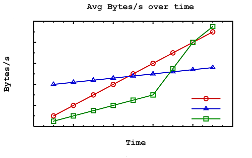
The initial report that they envisioned consisted of showing a couple
of lines, graphed over time.
The existing interface for configuring an event was as clear as the process. The expectation was that you would set the parameters, wait weeks to see what events occured over time, and if the events still weren't what you wanted, then change the parameters and wait again.
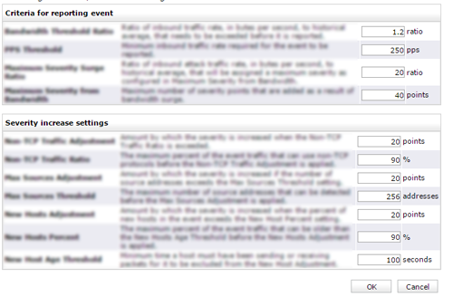 Event configuration
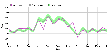
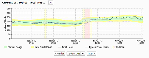
The above graph was supposed to show how a line compared to a normal range. Using this as a starting point, I was able to turn this into a more reasonable verison that showed the data more clearly. I also added in a way to find out when the data ever went outside of the normal range. This region could be configured more easily, and immediate feedback could be shown
However, in doing this, I needed to find out what made a range normal. In talking to our sales force, it was clear that 'normal' wasn't enough and that several different severities were needed. While this was straightforward, I needed to come up with a way to let users set this up. Previously, this system was a trial and error system that stretched over weeks or months to determine that a system was appropriately tuned. I came up with a way to let users do this almost instantly and to get real-time feedback over this.
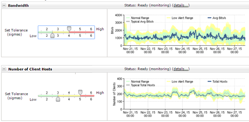
This could then be enhanced to allow users to see where the value stepped outside of normal, which creates the events.
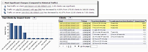
Additional tables of data were requested to provide more information about why the alerts were firing, which is what we had done in the past. However, it seemed like we were always forcing the users to do all of the work to figure out what the data meant. We had the expertise internally to make that determination already, or at least to provide more succinct information to the user. So, we began to flesh out the report, first by adding indications of what data was important
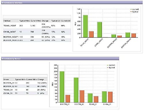
and then by summarizing the information at a higher level. This way users could look at only the summary, or they could look further to find out why we came to the conclusions that we did.