Skills Utilized web analytics |
On the other side, websites aimed at creating an 'artistic statement' are often exceedingly unusable. The most common use of sites in this category is to showcase a person's art or graphic design skills. As a generalization, these sites are created almost solely to establish the mood that the artist wants. Usability is not a strong consideration, and rarely do the site developers focus on whether other people can find the information that they are seeking.
Between these extremes is a narrow range of other sites. 'Adult oriented' sites often follow an inverse color scheme of the standard business sites, using white text on a black background. Other than that, only a small percentage of sites use non-standard color or graphic arrangements, while still trying to maintain a high standard of usability.
The screenshots included have had the text and logos obfuscated for confidentiality reasons, but the general layout is included, along with what the design was testing.
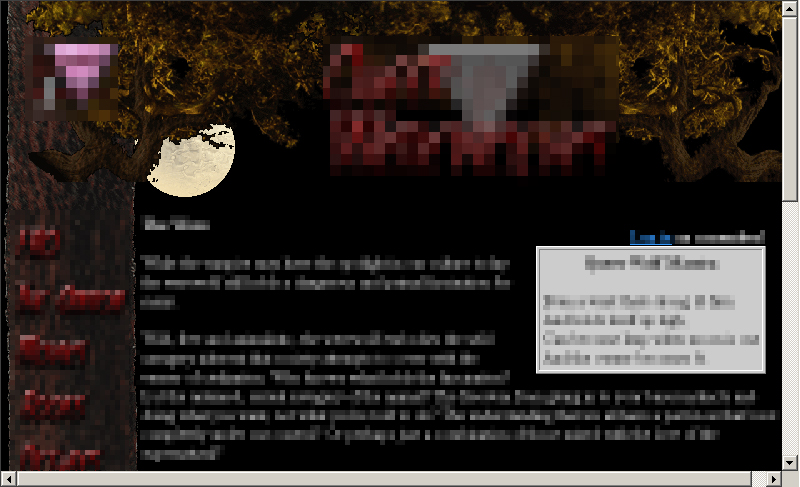
However, once chosen, the overall color did not need to remain unbroken. Visual interest could be added and parts of the text could stand out more if areas with a background near the opposite end of the spectrum were included. A part that is often missed by 'black background' sites is that the three link colors also need to be carefully chosen to ensure the colors stay within the standard color families (blue, purple, red), but still be readable. In this screen, two different link styles (color schemes) needed to be used; one for the dark part and one for the light. Surprisingly, though the colors were quite different, they could be chosen so that they were readable on their background, and still looked like they were the same color. |
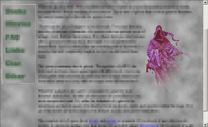
This layout used layers, minor DHTML animation and subtle background sounds to try to create the full effect. The background and text colors had been established from the previous interface, so the focus at this point was just on creating a full atmosphere. Though animation usually distracts from readability, if the animation is kept subtle and with a predictable motion, it did not appear to have any adverse effects. The background sounds worked within the context of this site, but might become annoying if people had to visit the site frequently. |
What I found was that the use of a fixed background image had only
very limited success. In order to prevent the image from interfering
with the sites readability, the image had to be washed out to such
an extreme degree that it was no longer identifiable through
the text. If the contrast within the image was made even slightly
larger, the text became almost impossible to read. Generally when
sites experiment with background images, most users have been forced
to use the Still, though the image could not easily be seen or made out, it could still carry some minor emotional impact. |
Again, to make the content stand out, the background really had to be made secondary in importance. So, the effect is again diminished, but not absent. |
This interface did provide a compromise between usability and atmosphere. The animation diminished the readability of the content slightly, by either distracting the reader when the effect was seen out of the corner of the eye, or by actually getting in their way of the text they were reading. However, the effect was made slow and subtle, which minimized the distraction while adding to the effect. For a single introductory page, this didn't seem to cause any overall problems. However, I would not use this effect on a page that required concentration to read, or reuse this effect on multiple pages. |